Thursday, January 31, 2013

Catch Up Week Reflection: Infographics: Area Bubbles

While working on my infographic, I was having difficulty thinking of unique and interesting ways to show my data (instead of just using bar graphs over and over). This led me to Lynda.com's tutorial on Infographics: Area Bubbles.

The presenter, Shane Snow, shows you how to create good and accurate visual representations of information for your infographics.

He explains the importance of not just eye balling visual representations (bubbles, etc), but actually making sure that your visual representations are in proportion to one another. To do this, you actually use Excel and some mathematical formulas to come up with the right proportions. (He clearly explains how to come up with the right #s!)

Note: I likely won't be using circles...I'm hoping to use some kind of glyph (like a camel). I'm thinking I do the same thing by using percentages... For instance, if my biggest camel represents 25 universities, and I have another camel representing 5 universities, I should be able to use Image>Scale> and then Scale down 20%, since 5 is 20% of 25. I will have to play around with this.

Then he opens up Photoshop and shows you how to draw a couple of circles according to the right diameter size (that you found when doing the calculations for proportion) and label each bubble (which he recommends doing as you go, so that you don't get confused later).

Then, he shows how to arrange and add details, making the image is more visually interesting.

Even though the content (making bubbles) isn't directly related to my content, the overall message of using proportions and then adding detail and flare to create an artistic style to fit your content/subject matter and own aesthetic sense is transferable to anyone and any infographic.

Later tonight, I will probably watch the last tutorial in the series. Because I hope to start drafting my infograph design tonight or tomorrow.

Sunday, January 27, 2013

W4: Infographic Storyboard


Title: Critical Languages of the Central Asian Region

Purpose / Goal: To educate and inform
This infographic will focus on educating and providing information about the critical languages (as deemed by the US Department of Education) in Central Asia. It’s main purpose will be to act as a marketing tool for a center whose mission is to disseminate information about Central Asian languages. The audience of the information are people who are unfamiliar with the languages of the region.

Narrative Description of Content and Design:


The infographic will be based on a 11"x17" poster size and will be divided into 4 sections:
Languages spoken in Central Asia by country and population of speakers of languages by country
Overall population of speakers of each language
Types of writing systems used for each language (Arabic script, Cyrillic, Latin, other, etc)
The numbers of American universities that offer classes in each language

To gather this data, I will use the U.S. Department of Education’s List of Critical languages, census reports for the CA countries, and online resources through various university language programs.

The first part, Languages spoken in Central Asia by country, will be represented using a map of Central Asia and a bubble graph will be used to express the population of speakers of the language by country.

The Overall population of speakers of each language will be depicted using bar graphs showing the comparison of populations. (I haven't decided yet if I will split the information into three charts: one for Turkic based languages, one for Persian based languages, and other...I think I'll wait until I start putting the charts together to see how easy it is to read the information.)

For the Types of writing systems, I was planning on doing some kind of Venn Diagram since many of the languages overlap writing systems that they use.

I'm not quite sure how I'm going to show the universities that offer classes. I'm imagining a comparison chart of some kind using glyphs, but I still have to work this out.

The overall design for the poster will use Central Asian colors: like beige, orange, golden, red, etc. and the background/borders will use Central Asian patterns like often seen in tapestries and rugs. For the titles and subtitles, I will use a font called Psuedo Saudi that looks like Arabic script.


Saturday, January 26, 2013

W4: Project Representation

About our Project


Team VidTech2.0 will be conducting an intervention of the design of the training Team VidTech created in Fall R521: CeLTIE Windows Movie Maker Workshop, wherein we created a hands-on, interactive workshop for language learning teachers interested in learning how to use the free movie editing software Windows Movie Maker to edit their own personal video clips.

Part of the feedback we got from the workshop attendees was that they liked the workshop, however, some thought it was too long, some thought it went too fast, not allowing enough practice time. We realized that this was directly related to the learners' own comfort level with technology. Those who were very tech savvy flew through training on their own using the Student Materials. And those who were less tech savvy followed along with the instructor, asking more questions and needing more practice time. Because we cannot predict or control the level of technical familiarity and comfort of workshop attendees, we decided that perhaps the best way to adjust this factor is create a self-paced workshop. If we redesigned the workshop to be delivered via computer based training methods, then learners could complete the objectives at their own pace, while still keeping the interactive elements and engaging active learning.


Project Representation

So now that we have established our intervention and its justification, we must consider our decisions for organizing and representing content.

As related to the actual software instruction of the project, it is very important to be accurate. Using clear and concrete examples of how to complete the tasks via screen captures (both still and video) will be very important. However, we will also be engaging the learner by challenging them to consider why they would use certain elements (captioning, voice over, sound effects, etc), which can be achieved by using more abstract representations, forcing them to think of specific examples.


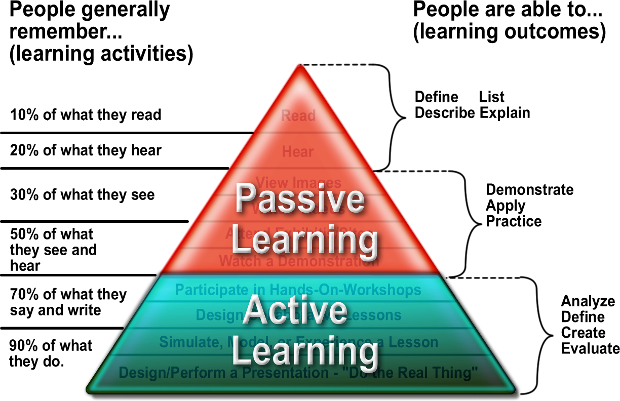
Because of the constraints of the medium in which we have chosen to deliver the content (via online asynchronous website design), there will be a large portion of Passive Learning, reading explanations, observing pictures, watching videos, etc. However, we will also include Active Learning components as well (asking review questions, giving them opportunities to practice in their own windows, etc). By having the learner engage with the content in multiple meaningful ways, our goal is to access their prior knowledge (of both pedagogy principles and software/technology intuitions) and build on them with the knowledge of the new content.

In this training, learner motivation will be a key factor, since the learners will be completing the tutorial independently and self paced. Those learners that push themselves to engage with the content and active practice will get more out of the training than those who chose to passively watch the tutorial, but not engage in the interactive actitivities. And that is something that will be out of our control in the medium selected.

Friday, January 25, 2013

W4 Reflection: Infographics: Planning and Wireframing

This week, I decided to checkout the Lynda.com tutorials on Infographics, to help me prepare to create my first infographic. I found that there are actually three tutorials on Infographics, so I decided to start with the Planning and Wireframing tutorial.

The presenter, Shane Snow, starts by showing some examples of Infographics he has published, and discusses some of the considerations he had when making his design decisions to develop these Infographics.

Then, he dives right into how he organizes his data. I was surprised to see that these highly visual designs actually start out in Microsoft Excel! He explains how it is important to start in Excel so that you can clearly organize the data and easily visualize the outliers (far from norm numbers), trends (a gradual movement of data), and counterintuitive facts (things you didn't expect to see).

Then he covers choosing the right visualizations, by explaining that with Infographics, one should:

  • not illustrate something that can be easily explained in words
  • always choose the one that best illustrates the data clearly

Some common types of visual representations on an infographic and their purposes
Bar charts - basic types of comparisons
Pie charts - good for showing comparison (when the sum of all parts add up to 100%).
Donut charts - ^^Pie charts with holes
Scatter charts - Good for showing trends
Line graphics - Also good for showing trends
Area charts - Useful when comparing the size of different things (usually over time)
Bubble diagram - Used often on maps to show relations
Time lines - illustrating events
Venn Diagrams - show comparison relationships
Glyphs - the pictures you see on infographics
Flow charts - useful for depicting evolution or relationships

Next, Shane addresses the considerations for deciding dimensions of your infographic.

  • If on the web - what is the width of the blog? Is their a height constraint
  • Info graphics for textbooks - should fit the page (8.5 x 11?)
  • If you have no constraints, make it fit the story you want to tell
  • Always consider that your infographic may be made into a poster at some point, so think of those dimensions.
  • Always draw in highresolution/vector, so you can make it bigger if/when you need.

The next lesson is a mini lesson in Photoshop. This part was really less interesting to me, as I didn't really learn anything new about Photoshop. However, it was interesting to see that you design the basic layout (or wireframe) of the infographic begins with a layer of blank boxes with some text. And that throughout the design process, one should toggle back and forth between this wireframe and the more visual design.

Overall, I thought the information present was well organized and clear. As a learner, I was aware of the learning objectives set forth, and felt his explanations along with use of examples and non-examples were clear.

I will most likely also complete his other two tutorials on infographics before I complete my own! :)

Tuesday, January 22, 2013

My 2 Great Infographic Design Principles

First, I apologize this blog posting is a few days late. I was confused and didn't realize we had to post this blog in addition to the google docs addition.

After reviewing tons of infographics, I realized that there are many steps to creating one.

Beginning with: Start with an idea. You need to know the content, like hamburgers.

Then, Decide on the purpose. The content might be on hamburgers, but is the purpose to examine the nutritional value of hamburgers, compare which hamburgers taste the best, explain how to make the perfect hamburger, ask what the most preferred toppings for hamburgers are....?? What is the point of the inforgraphic and what is it meaning to do/and or convey to those who view.

This leads us to my first Great Infographic Design Principle: Know your audience.

I've seen some very graphic heavy infographics that are more flash than content. These would not be seen as valuable for many academics and researchers that value facts and resources. And I've seen some very text heavy infographics that might appeal to an academic, or someone heavily invested in the content, but that many who see it (including me) get overwhelmed by the text and choose not to bother reading. So, infographic content and design developers really need to know their audience and make specific choices based on how to best convey their message and reach the desired target population.

This leads us to my second Great Infographic Design Principle: Use your words wisely.

To me, the worst thing most infographics can do is to be too wordy. Because, while some people (if they are highly invested in the content) might be willing to read paragraphs of text on an infographic, most people are not. Infographics should really use the graphics to tell the story for the most part, and every word in the design should really earn its place there.

I think it's hard to give examples and non-examples for these two related  principles, because, as I said before, if you know your purpose and audience, and you know they would want lots of factual information and support, you might want to use more text.  But I'll show examples and non-examples of infographics that I believe got it done right or wrong.


Example
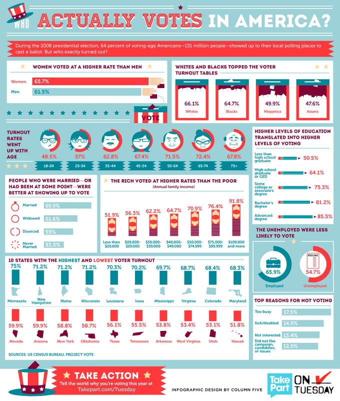
This infographic seems to be reaching a general population. I think it assumes that any and all citizens would be interested in who votes. Therefore I think sticking to short phrases and numbers with clear representative pictures was a smart choice.

I don't feel overwhelmed by the information and my eye can easily see what the different charts and or figures represent.

And, the inforgraphic even lists its sources (US Census Bureau and Project Vote).


Non-example
My head hurts just looking at this infographic. I don't know WHO the intended audience is, but since it says "Your New Health Care System", let's just imagine for a moment that it is the same audience as the infographic above: the general population; the average citizen.

There is just too much. Too many colors. Too many words. Too much writing. The average person isn't going to read any of this. Well, maybe a few of the big circles, but that is it. Nothing about this graphic makes explaining the new health care system any easier to understand, only harder! If that were possible!


Non-example
Another example of just too much text is this Evolution of Apple. It's a time line of Apply Macintosh's company and products, but it just looks like a power point slide. A very busy power point slide with too much writing.


Example
This is a perfect example of letting the graphics and minimal text and numbers, do the talking. There is a short paragraph explaining the infographic, but it is not overpowering, and the rest of the infographic uses just words or phrases along with an image to convey the meaning.

Notice this one also provides a clear ledger and a source.

Thursday, January 17, 2013

W2 Reflection: Engaging Webinars

This week I attended a free Adobe Connect webinar entitled: Blahto Aha! Engaging Learners in the Virtual Classroom and it was awesome!

The facilitator was Cynthia Clay, president and CEO of NetSpeed Learning, who has over 25 years in managing and development.


Usually when I'm "attending" webinars, I'm checking my email, I'm updating my Facebook status, I'm clicking around on Pinterest. But not today. For 60 minutes, I was actively listening and participating in the discussion.


I think this seminar would be VERY useful for anyone who designs or facilitates professional development trainings/workshops/seminars via Adobe Connect (or similar platform). First, Clay introduces the three deadly mistakes for "blah" online learning experiences and then outlines give practices to engage the student. Then, she delivers a content based example of how to actually apply the principles being taught. And, what I liked the most is that she actually taught the seminar using the principles that she was teaching (in my experience that is a pretty rare thing unfortunately).

If I had to give a one sentence summary of her plan, it would be: Introduce a concept, then ask the learners to respond to it, and then build a dialogue based on their input.


Those concepts seem simple enough, but the majority of online learning situations I've experienced have been more like lectures than dialogues.

Throughout the webinar, the speaker introduces tips and tools for leading a webinar in Adobe Connect  (which all faculty at IU have access to) that is engaging, instead of just a real time online lecture where the participants spend the majority of their time checking email and playing on Facebook.

Overall: A+


Major points of the presentation:


Three deadly mistakes for blah learning experiences
  1. Failing to capitalize on the visual medium. (Use your pointers, engaging slides/graphics. But it is a fine line, be careful not to use too much, which would take away from your presentation.)
  2. Not engaging learners in the discussion (designers AND facilitators need to think about this…make it vitally important that the learner participate… LEARNERS LIKE TO CONTRIBUTE!)
  3. Lecturing until the cows come home.
Five discovery learning practices
What is discovery learning: inquiry-based learning (both to and from the learner) that allow the learner to discover; learning by doing.
Types of Discovery Learning
  1. Guided discovery
  2. Observation and reflection
  3. Problem solving
  4. Simulation-based
  5. Case studies
The Discovery Process
  1. Prepare the learner with information
  2. Ask questions to encourage reflection
  3. Provide examples and models
  4. Demonstrate, if applicable
  5. Offer a case or identify a problem
  6. Allow peers to collaborate and problem solve
  7. Debrief to elicit connections and relationships
  8. Plan for application
Design Strategies for engaging webinars:
  • Bring up a new idea, then ask a question (using emoticon/status icons)
  • Ask a question, the open a chat window for discussion. Take the time to discuss some of the people’s answers. Then go over the question, using people’s responses as a guide for a conversation.
  • Show a video. Open a chat window and ask them to respond either during or after. Again, go over responses (use names when possible) (IF YOU SHOW A VIDEO, GIVE THEM AN ASSIGNMENT FIRST…so they don’t use that opportunity to go and get a coffee or take a break)
  • Give an audio example. Give an assignment. Open a chat window for discussion. Again, go over responses (as described above).
  • Action: Write out a stem sentence and ask them to complete the thought/idea/sentence
  • Assign learners to lead short sections (must be coordinated ahead of time)
  • If working with a large group, hide the Q&A chat window so that participants can’t see questions (it’s distracting to the other learners). Allow your co-host to manage them out for you.
USE YOUR TOOLS! Adobe Connect tools Clay used throughout her webinar: arrow, live poll, chat discussion windows (split up by birthdate for large groups), emoticon/status icons (under raised hand), video/audio, and annotation tools.  Don’t over use any tool! Mix it up and diversify.

Hint: you can put your cursor in the chat window and ctrl-a to copy the chat and copy and paste it to save for later (even when watching the recorded version). Great for brainstorming sessions.

Facilitator Strategies: 
  • use people’s names whenever possible.
  • Use a dynamic voice (you can use a script, but don’t be monotone or sing-songy as you)
  • Especially in large group situations, have a host that will help manage the incoming chat messages.
Q: what if you have a chat window, but people don’t really write much?
A. It tells me that you didn’t warm them up first. Start with a yes/no questions and/or a poll, to ease them in to contributing and using the interaction tools. And make sure to read their responses and use their names so that they really feel like you are paying attention to them. The best way to undermine interactivity is to talk for too long without engaging.

Q: Chat or talk?
A. It really depends on the size. For a typical class-size seminar, use both in combination. Use chat to probe the learners for discussion.

Thursday, January 10, 2013

Infographic Topic Ideas


Topic #1: The languages of Central Asia


Explaining the different languages spoken in Central Asia, including where they are spoken, population of native speakers, scripts used for writing them, etc.


 Topic #2 Introduction to Dari


An in depth look at one less commonly taught Central Asian language: Dari. Go into detail about not only the history of the language (like proposed above, but for many languages), but also linguistic explanation, grammatical forms, and some survival phrases.

Wednesday, January 9, 2013

My Inforgraphic Example

Infographic by Amber Welch: http://d.pr/ievA
I'm drawn to this infographic first and foremost because of the content. I love to sew, so naturally I'm interested in an infographic representing one of my interests.

As far as design, the first thing that catches my eye is the old fashioned sewing machine. Then I notice the blacked out scissors/buttons/pin/thread, and finally my eyes almost simultaneously see the large needle and thimble.

The pictures aren't detailed, they are just blocked out images, but they are are strong against the background and stand out among the text, inviting me to read more on the page.

As I'm reading, I like the use of contrast (size, boldness, color, etc) of the most important words/phrases within the sentences. So even if I didn't have time to read every word, I could understand the main gist of the information being presented by merely reading the contrasted words/phrases in each section.

As far as the content goes, I like the unique facts the infographic provides. It is providing trivia-like facts that most people (even die hard crafters like me) wouldn't know, so it keeps me interested and wanting to read the next section.

I don't really have a strong reaction to the color scheme chosen. However, I really like that the majority of the page is in black, white, and gray, and that the designer reserved the teal and pink for contrasting elements. I personally don't like too much color on things I'm reading online...it distracts my brain and can actually give me a headache if I'm trying to read text amid crazy bold colors.

Tuesday, January 8, 2013

Introduction

My kiddos

Hi everyone! I'm Amber. I actually live in Bloomington, IN, but I am working on my IST Certificate via distance learning because I am a working mother of 2 (twin 5 year old boys). It's much easier to go "back to school" in the comfort of my home office while my kiddos are sleeping in the nest room than to attend classes in the flesh.

I currently work full time at IU as an academic specialist developing language materials and curriculums.  My specialty is language learning technology.

This past summer I took R511, and it was my second online course, but my first course since 2005 when I completed my graduate work at IU. It is fun and frightening to be taking classes again. It went well enough that I decided to try again in the Fall, taking R521 with Dr. Glazewski.

I decided that I wanted to pursue a certificate in IST for two reasons: #1 - to improve my productivity and effectiveness in my current position. And #2 - to broaden my qualifications from the world of language learning technology to more generally instructional technology and design so that I will be more competitive in the job market.

The main reason I'm interested in IST is because I am a "let's not mess around...do it right the first time and then let's all go home" type person. When I'm at work, that is time away from my family. I want all time not being spent with my family to be effective and efficient, because I want to feel like I'm away from them for a purpose. I cannot stand disorganization and inefficiency in the workplace. It's a waste of the company's money, but I also feel like it's a waste of my time.

I like IST/ISD because it is a systematic attack that finds what isn't working, proposes solutions, and applies them! Then, perhaps my favorite part: EVALUATES whether or not the changes are actually making improvements! This part is so important and so often neglected (at least in academia)!

I feel like I have a good basis of what IST/ISD does, but I'm looking for further education and training, and of course, accreditation via a certificate.